UI/UX: Redesign the Data Table Header for a Cohesive Layout
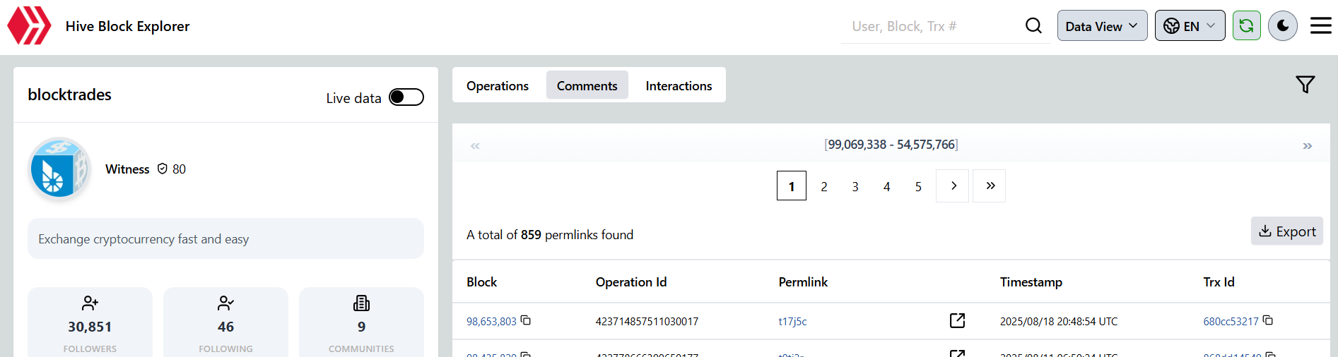
The current layout for the controls related to our data tables (specifically on the Account page) feels disconnected and un-integrated. The pagination controls, the total item count message, and the "Export" button are rendered as separate, floating elements with inconsistent alignment and grouping.
This creates a scattered user experience and makes the relationship between these controls unclear. For example, the pagination is displayed in its own container above the total count, which is not a logical flow.
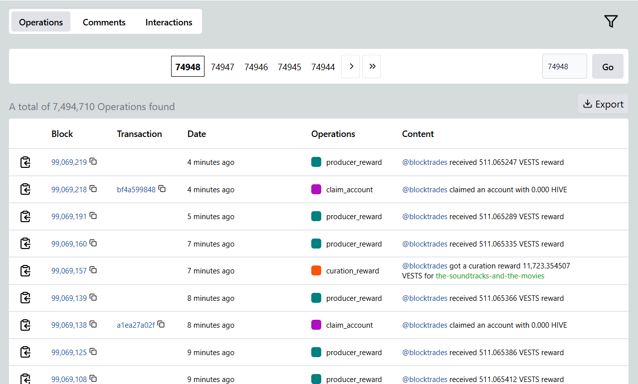
To fix this, we should introduce a single, unified "Data Table Toolbar" that will sit between the main tabs and the data table itself. This toolbar will logically group all related controls. The final result would look something like this